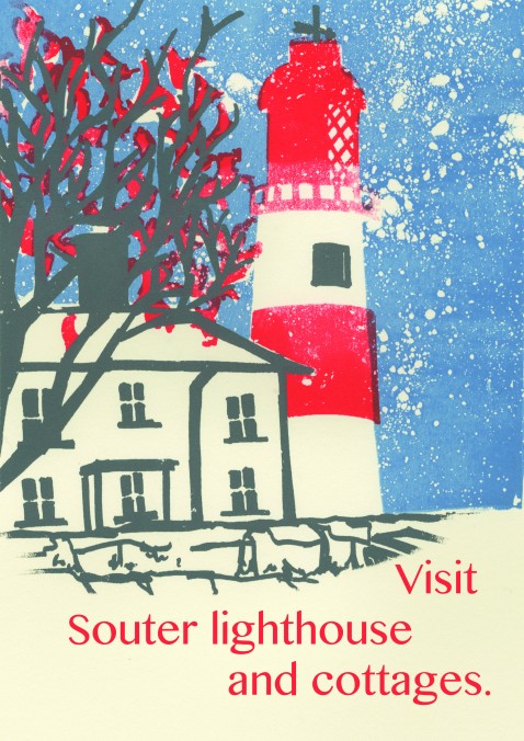
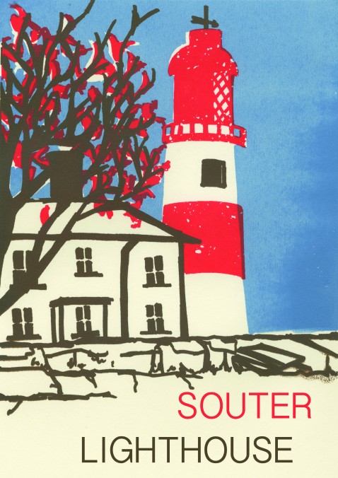
I think the first piece is more welcoming and also has a wintery look, because of the talc i used during the silkscreen process. The second is more fitting to our given brief, with the bold writing fitting to the 70’s holiday advertising posters and using block colour.
- Comment
- Reblog
-
Subscribe
Subscribed
Already have a WordPress.com account? Log in now.

